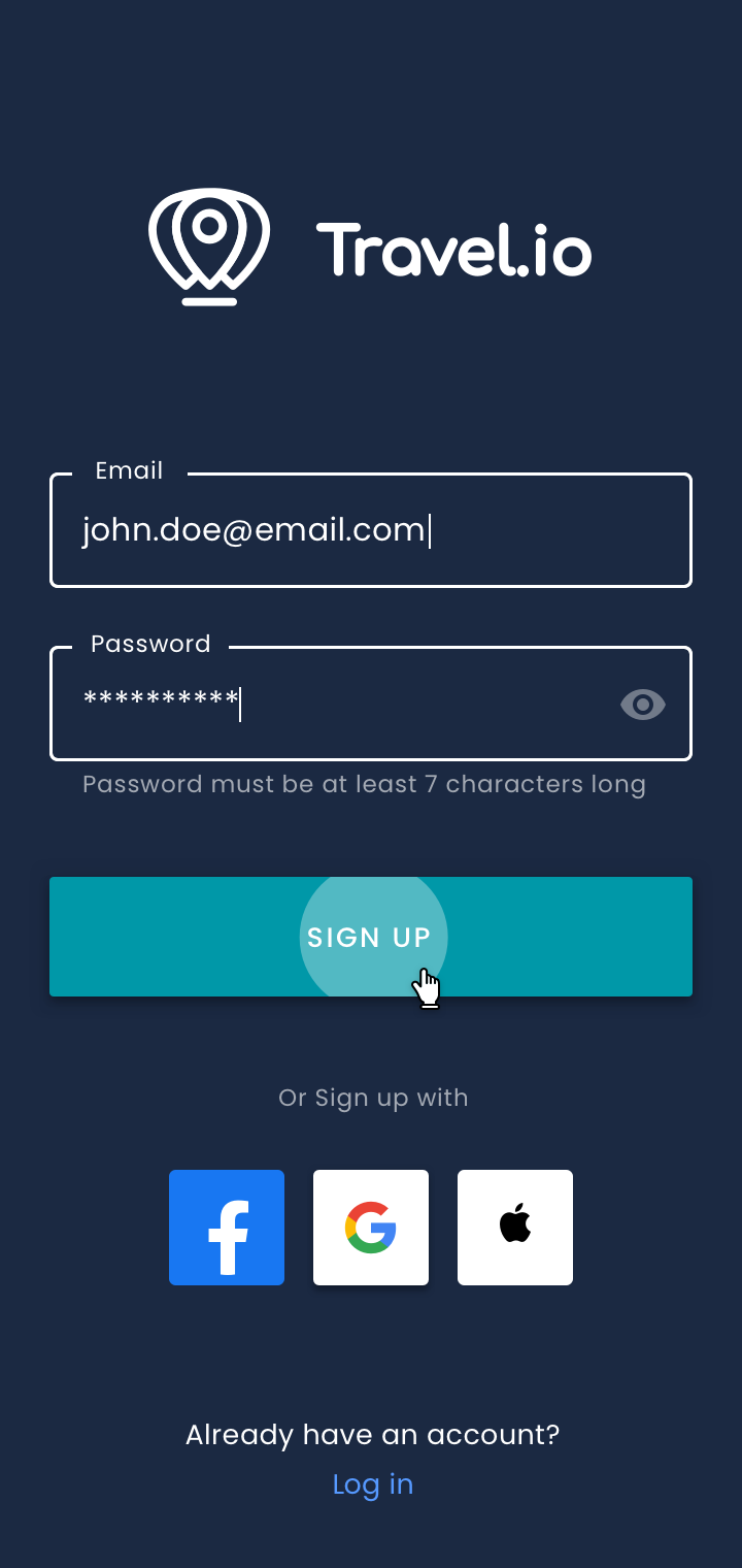
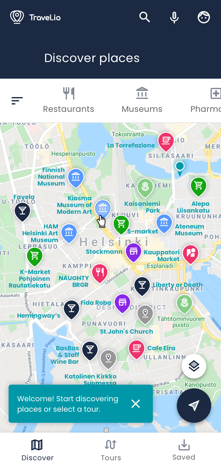
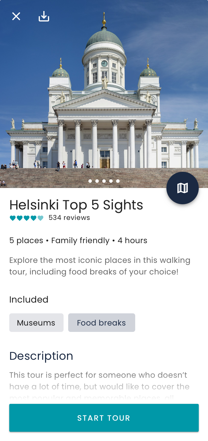
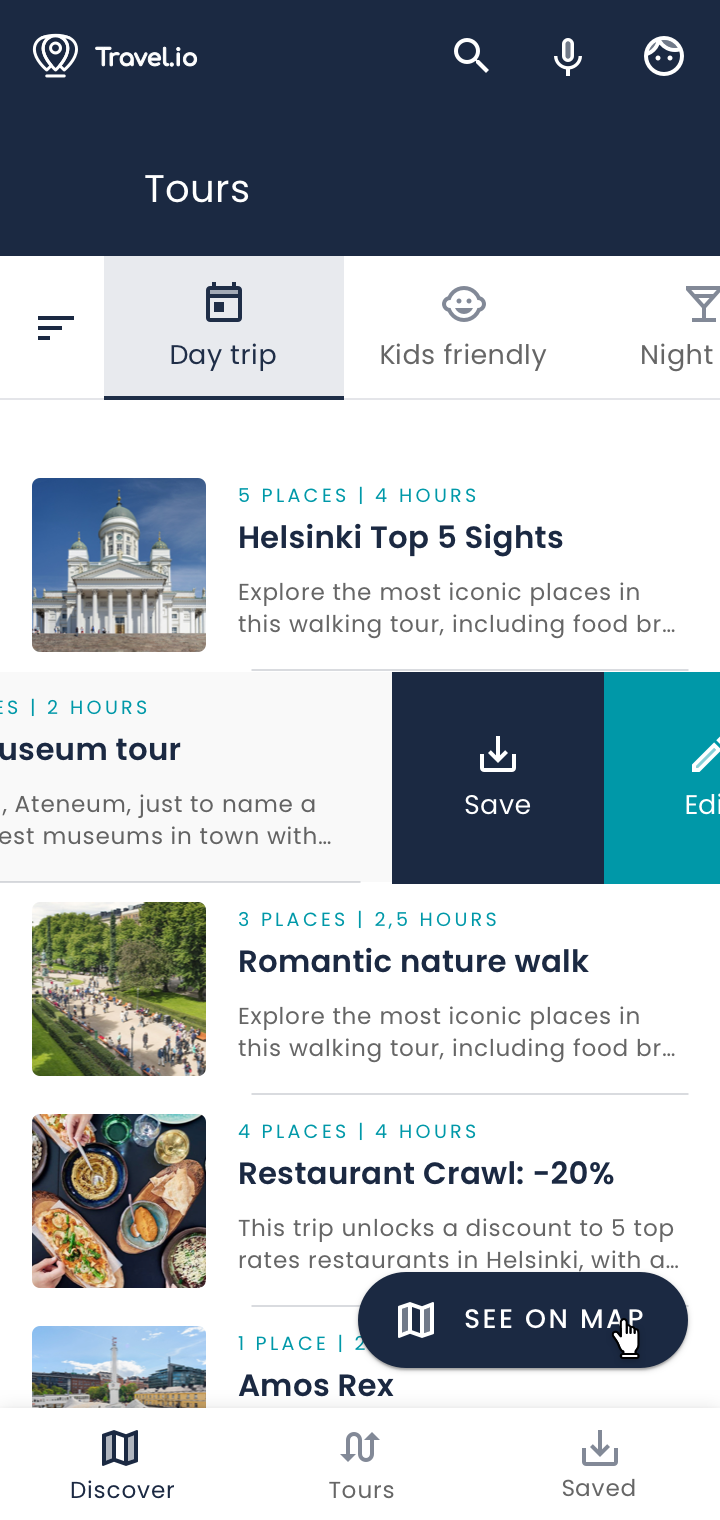
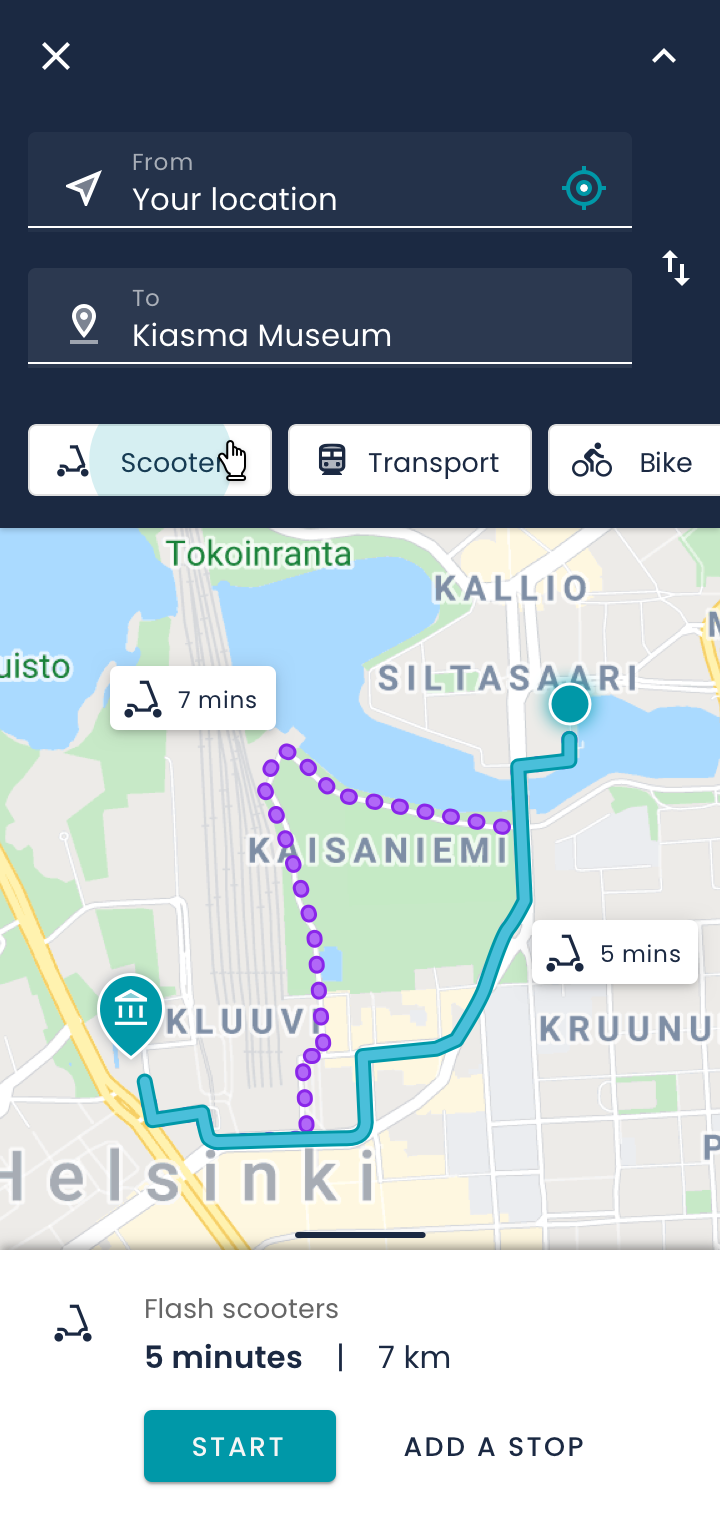
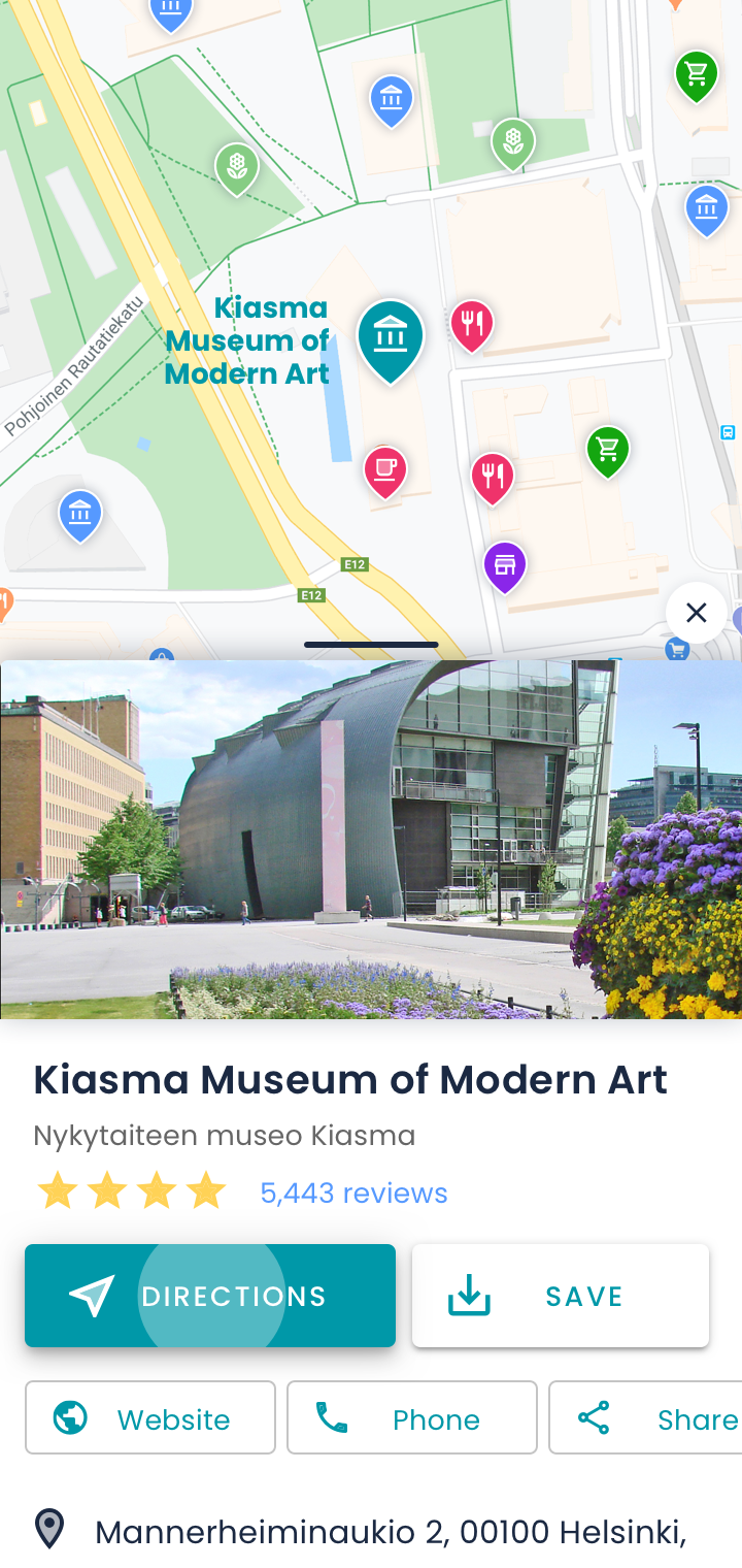
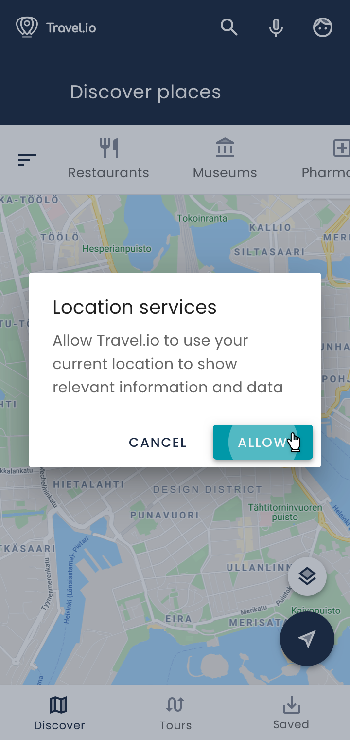
Travel.io is a travel app with premade sight-seeing tours, designed to improve traveling and navigation on mobile. I worked on the concept in 2014 with a team and as a personal project in 2020.
Role:
Visual / UX designer
Team:
UX designer, Marketing PM, 2 engineers
Timeline:
May - Sept 2014; Aug 2020
Output:
MVP, design vision
1. Problem space
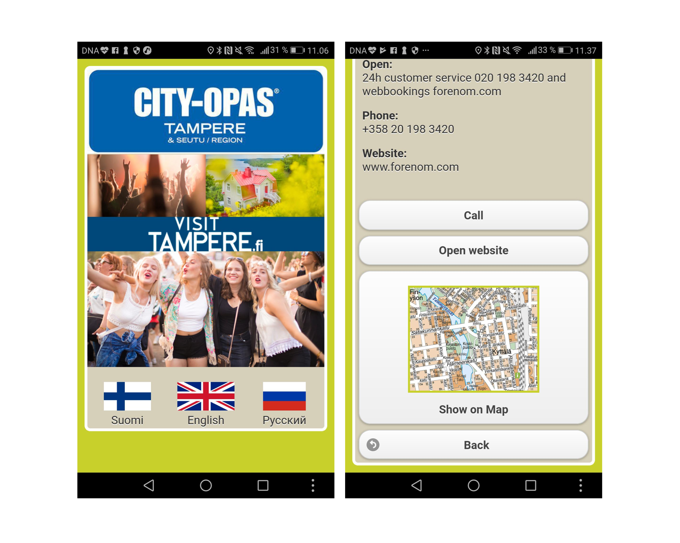
We were selected to work on a paid project for a client to uplift their travel experience and re-develop their guide app, Tampere City Opas. The app lacked visual design diversity, was poorly marketed and did not provide a lot of value besides being a digitalized map.
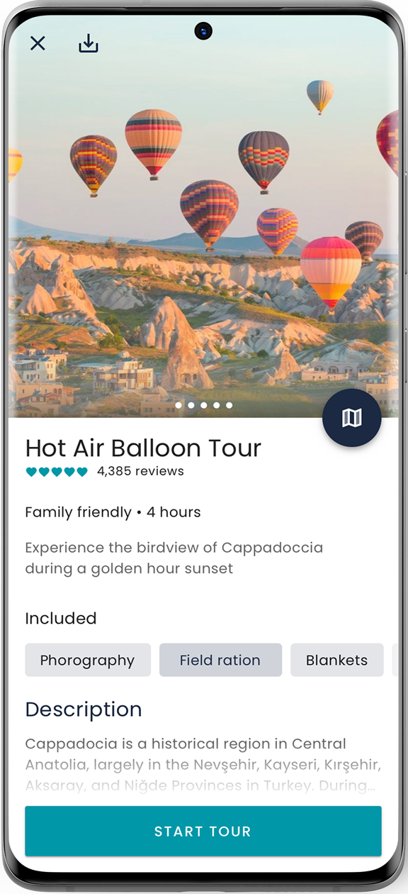
Our team brainstormed a larger solution to focus on - develop an app that would let people navigate through cities via pre-made tours. Back then, the market was not yet developed, Google maps did not include multiple destination routing, and thus we thought it was a good nieche to try.
To validate our ideas, we moved on to guerilla sessions with people from theme parks, travelers, and family groups.
2. Discovery
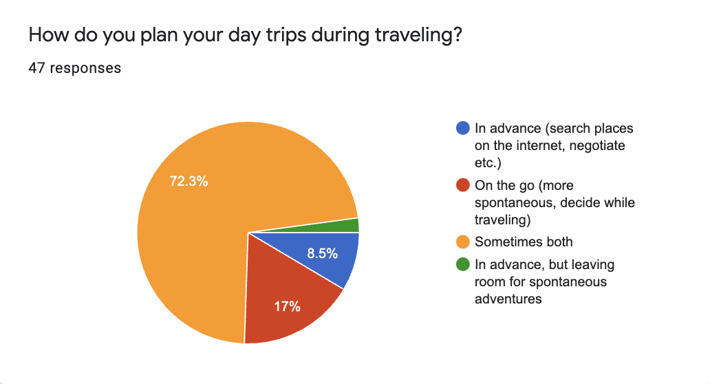
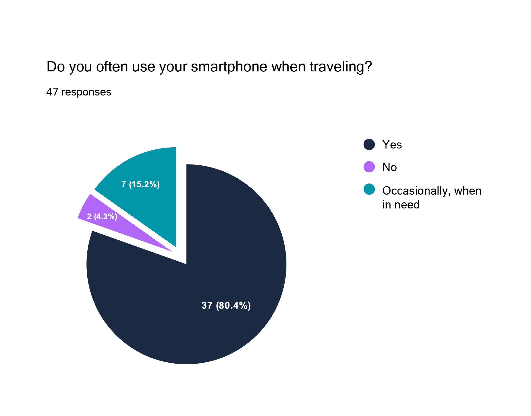
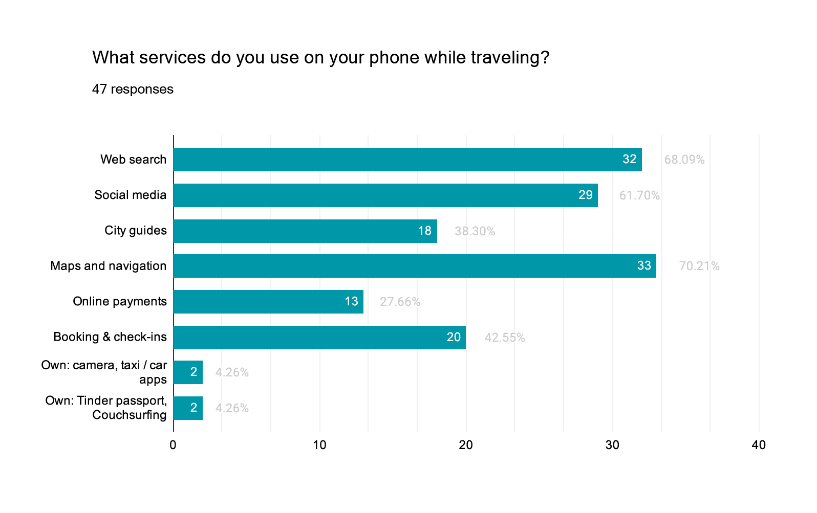
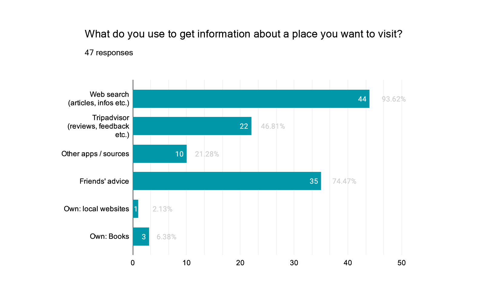
For research purposes, our team conducted several in-person inverviews, quick impression tests and written surveys. The purpose of the research was to gain insights of travelers needs and identify pain points in the active discovery phase of the traveling experience.
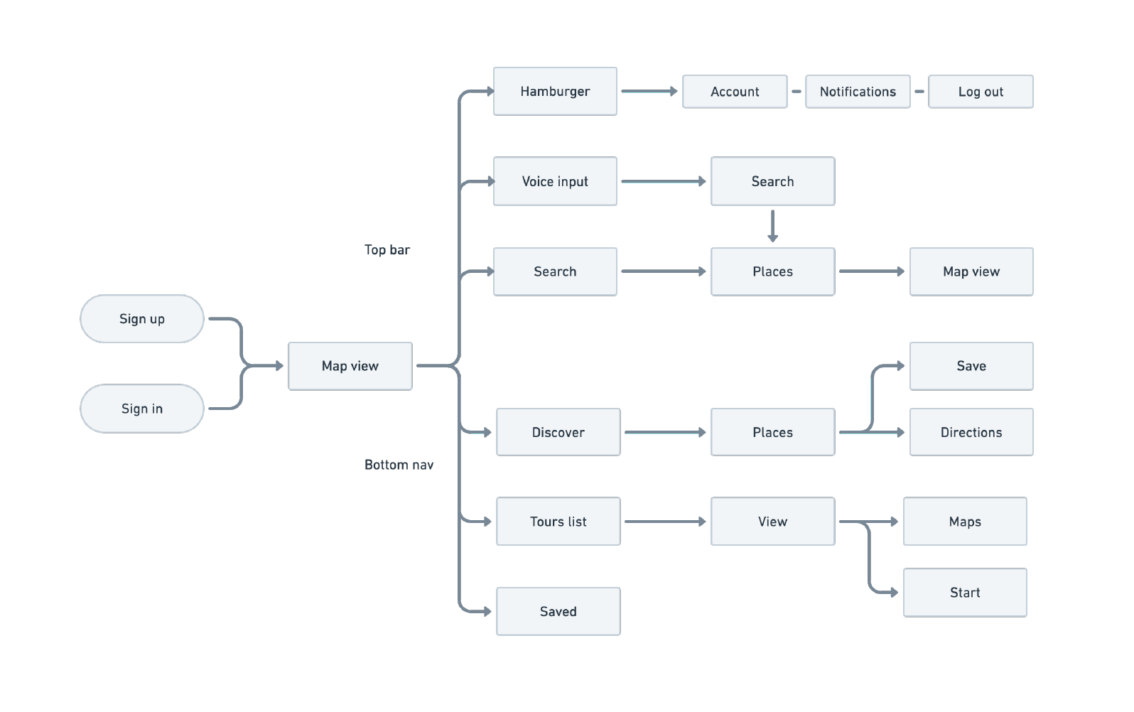
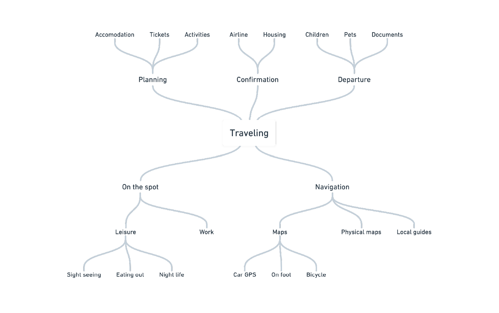
As a result, our target group of tech-savvy people between 18-40 years have displayed high usage of their phones and navigation in the active travel phase, as well as using multiple tools for navigation simultaneously. From that point, I mapped our first application draft.
Primary
3. Design
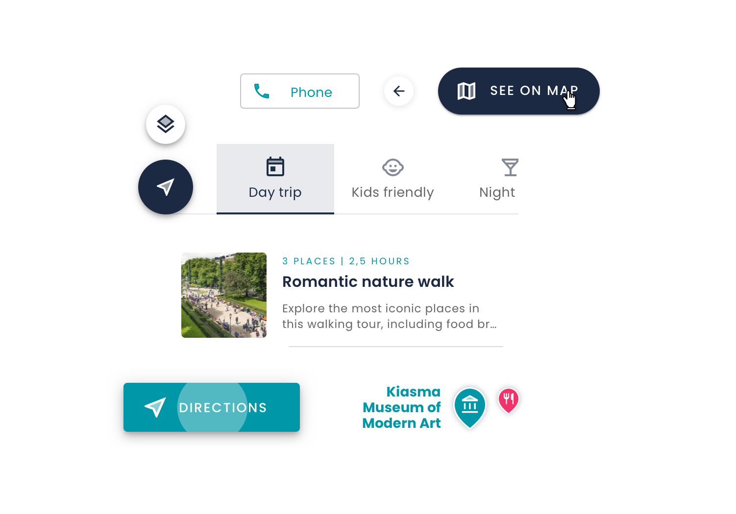
My approach to design was experimental at first, but more systematic later on - I chose Google Material framework to draft an MVP more efficiently. For the engineers, during our work together we managed to do:
- Developer work backlog
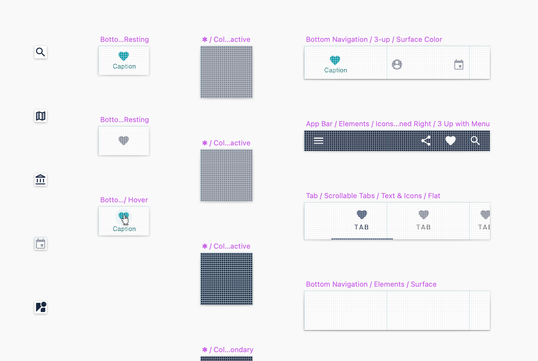
- Assets library
- Design styleguide
To validate my first design drafts, instead of conducting paid usability tests, I surveyed different people on our premises first, and after that I also tested on my network of friends, who could be potential end users of the product.
H1 / Poppins Regular
P1 / Poppins Regular
Primary
Accent
Neutral
OVERLINE
...The sable cloud beneath was dished out, and the car seemed to float in the middle of an immense dark sphere....
4. Results
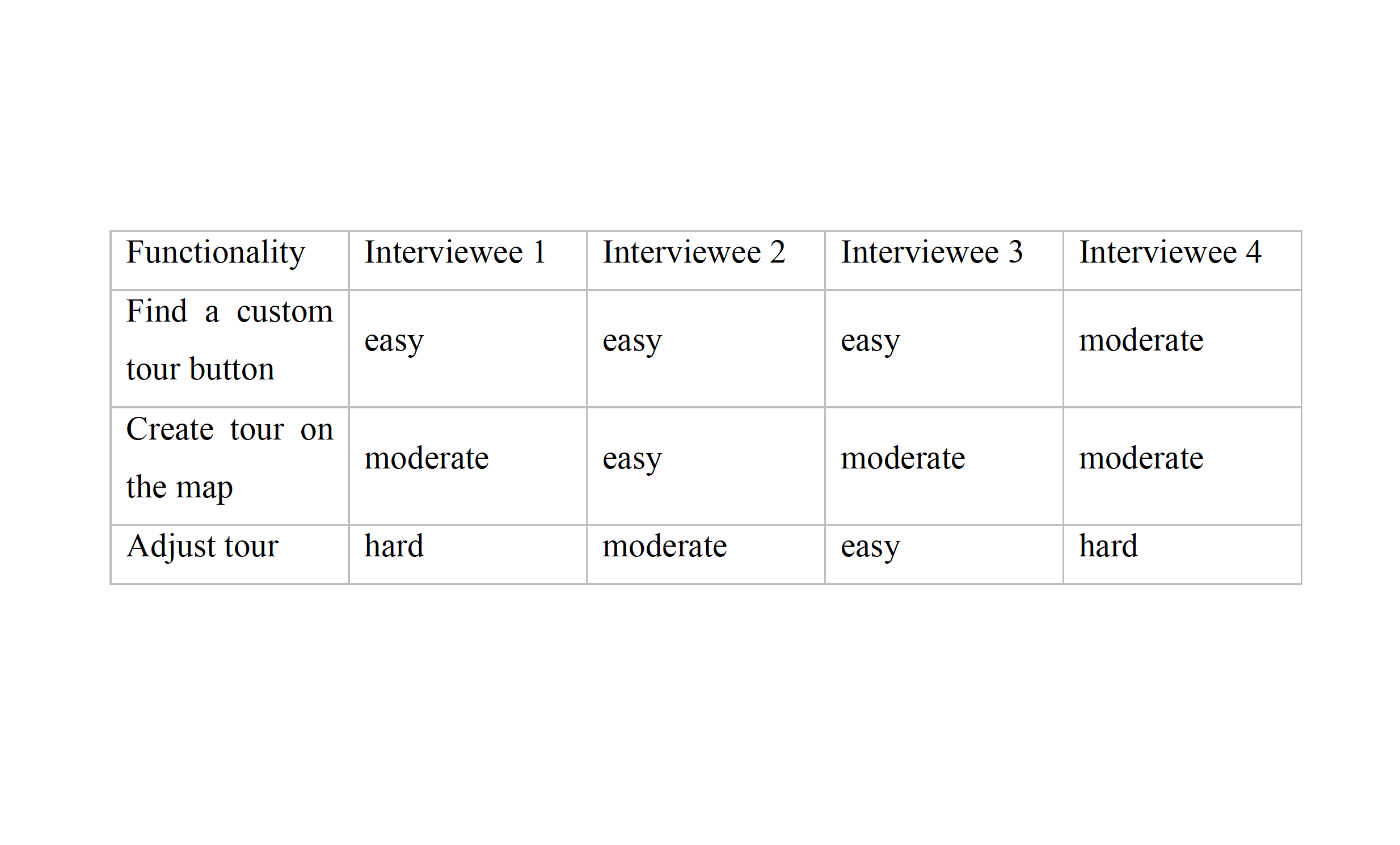
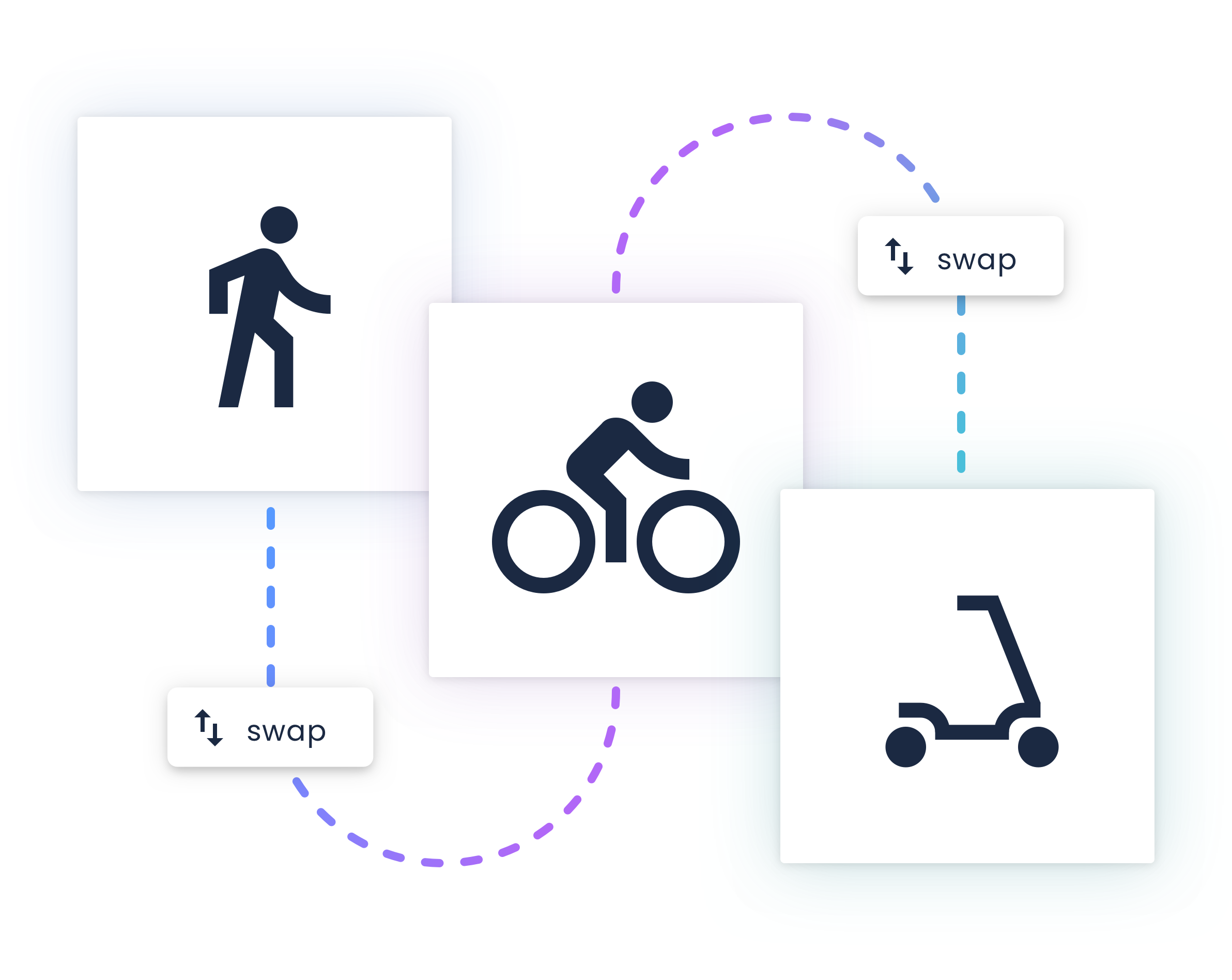
With the first usability test, some people were confused what the Tours section was. They were wondering what "Places" and time stamps meant, but after clicking around a bit they understood the concept and value behind it. Regarding navigation, most of the participants were very fluid and confident in terms of interaction, which was a big plus.
In conclusion, our team managed to ship the first MVP to the client and the development agency was happy and took over the concept.
Delivered:
+ Product pitch / sale
+ MVP & styleguide
+ User feedback
